Kay Jewelers
8 Weeks
Figma, Photoshop, Illustrator
UI Design, Visual Design, System Design
Where function falls short of feeling
Overview
Kay Jewelers’ current UI lacks emotional resonance and clear navigation, making it difficult for users to connect with the brand or find meaningful products with ease.
Designing a journey worth remembering
Solution
Enhancing the interface with warm visuals, intuitive browsing, and storytelling features created a more emotional and meaningful shopping experience.
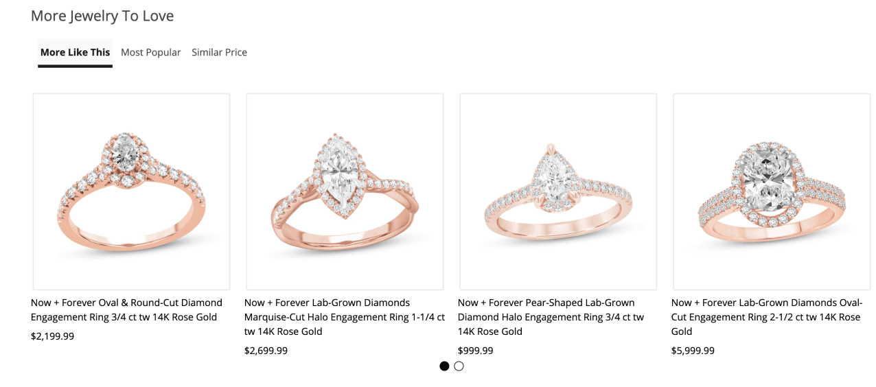
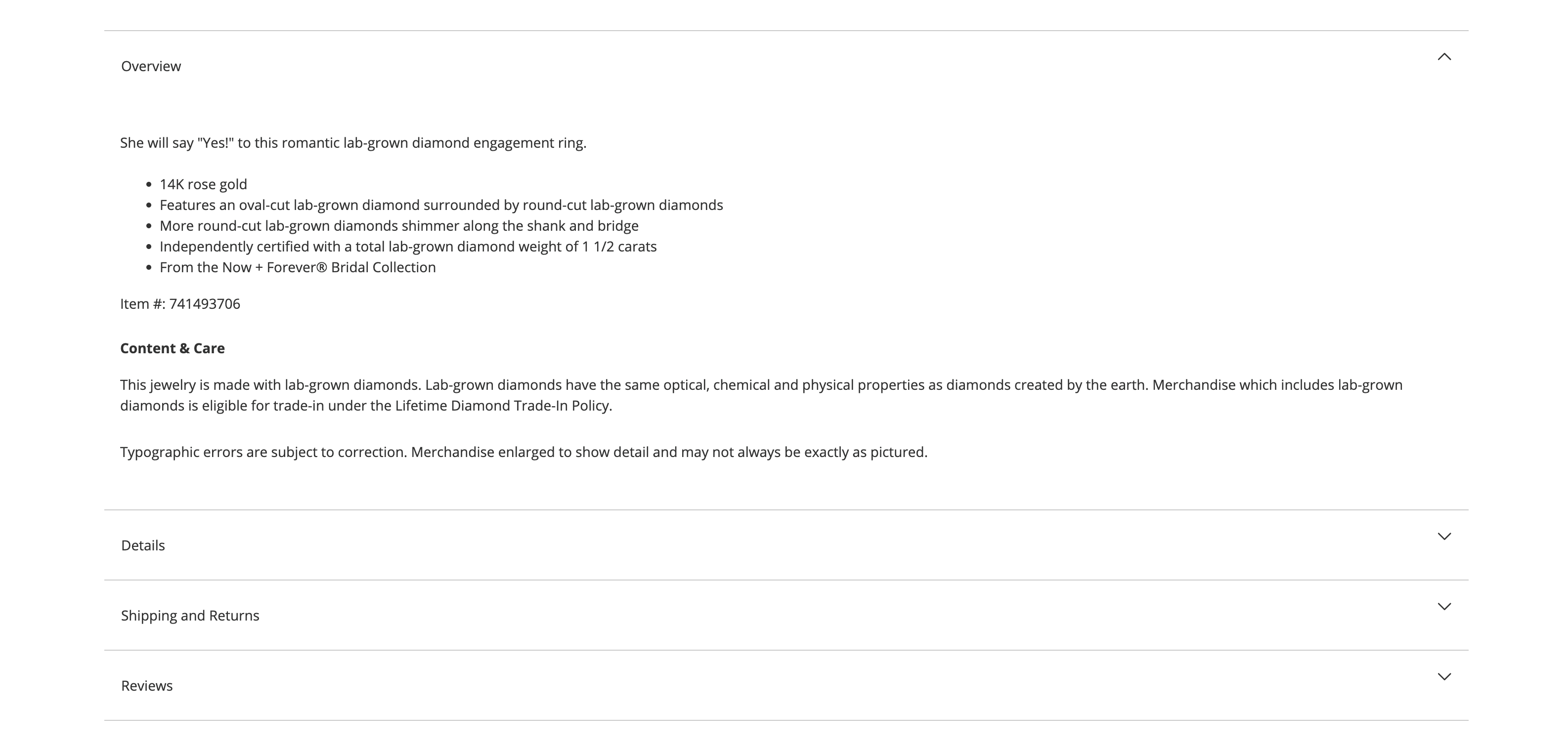
Immersive product storytelling
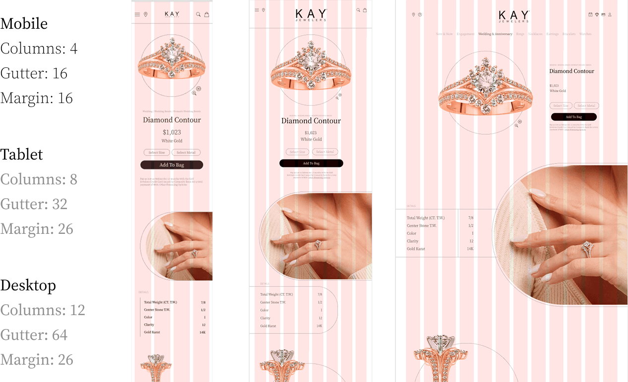
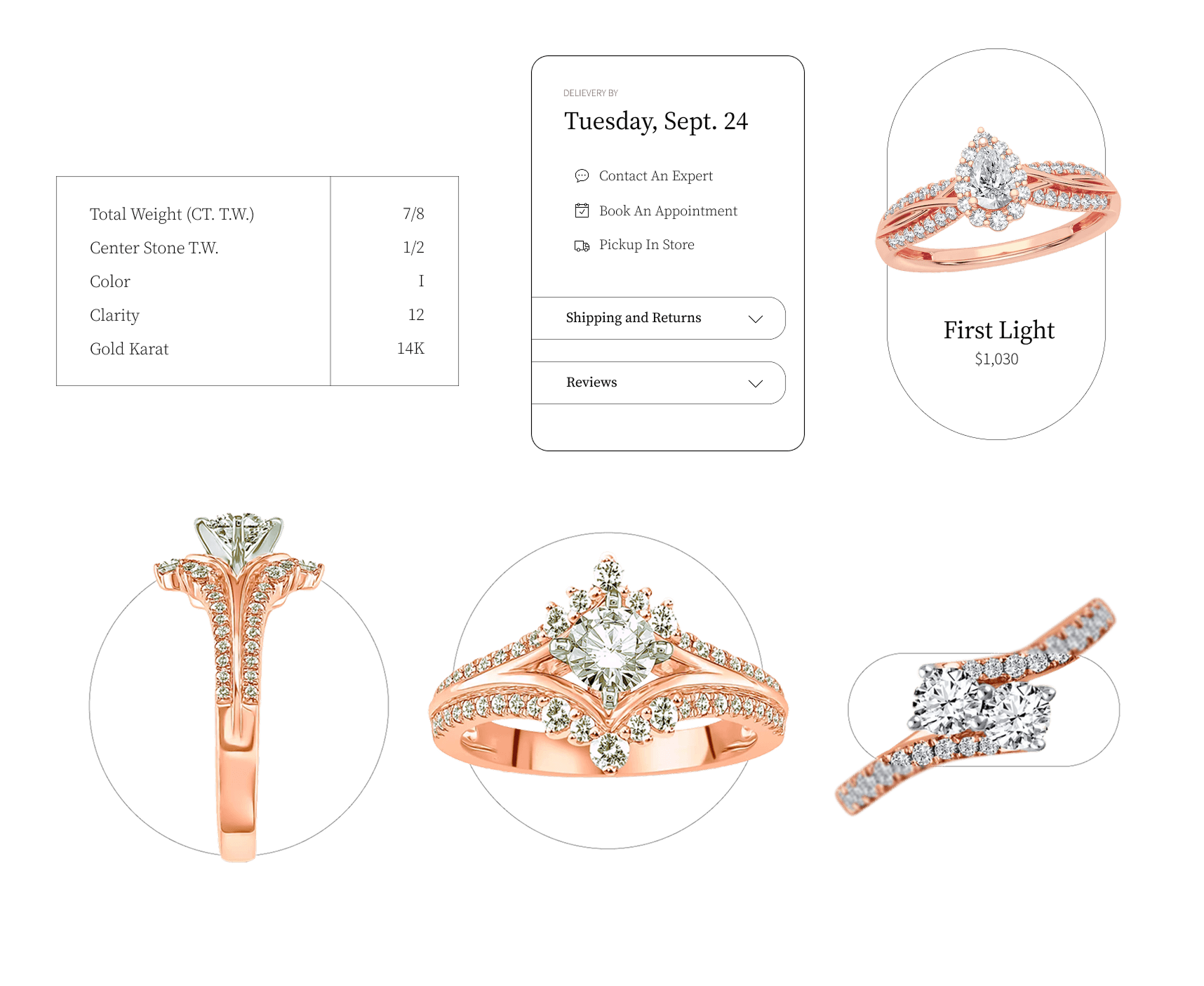
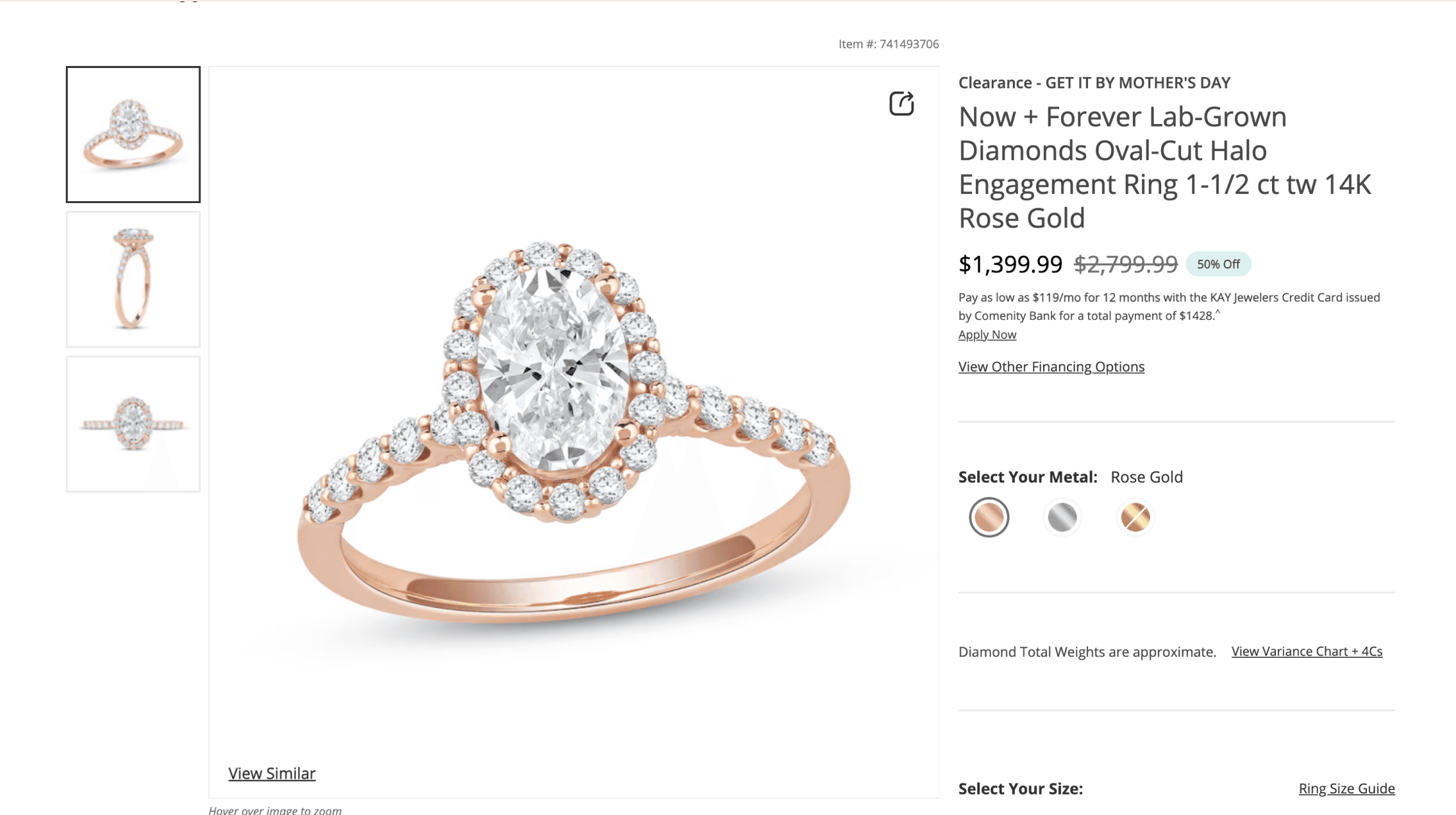
Desktop Experience
The desktop layout showcases high-res imagery, in-depth ring specs, and educational modules like gem anatomy and diamond clarity. With room for layered content, it supports thoughtful shopping and builds emotional connection.
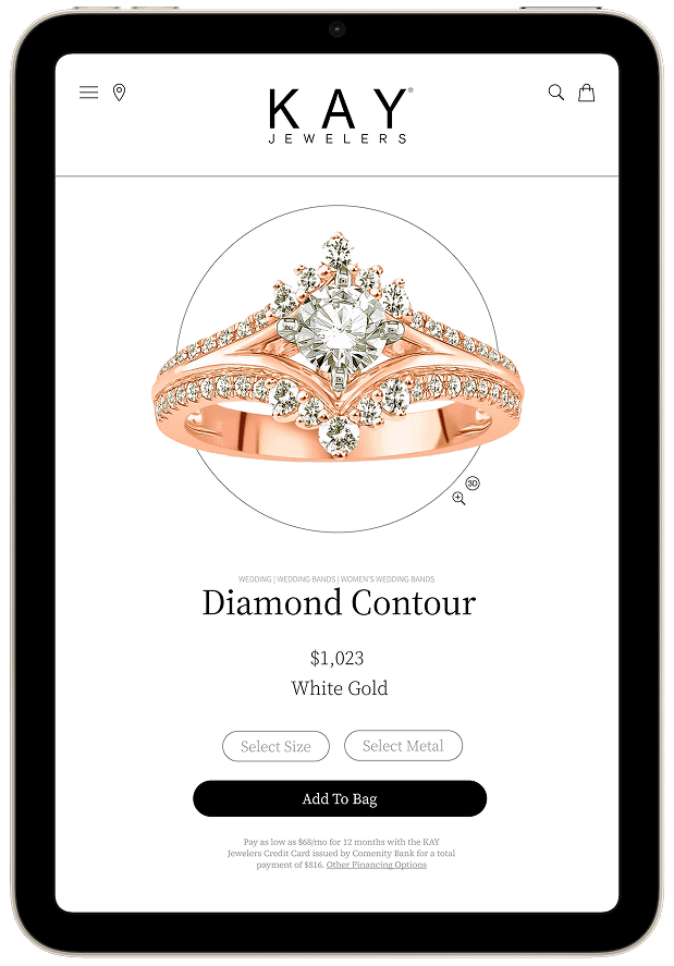
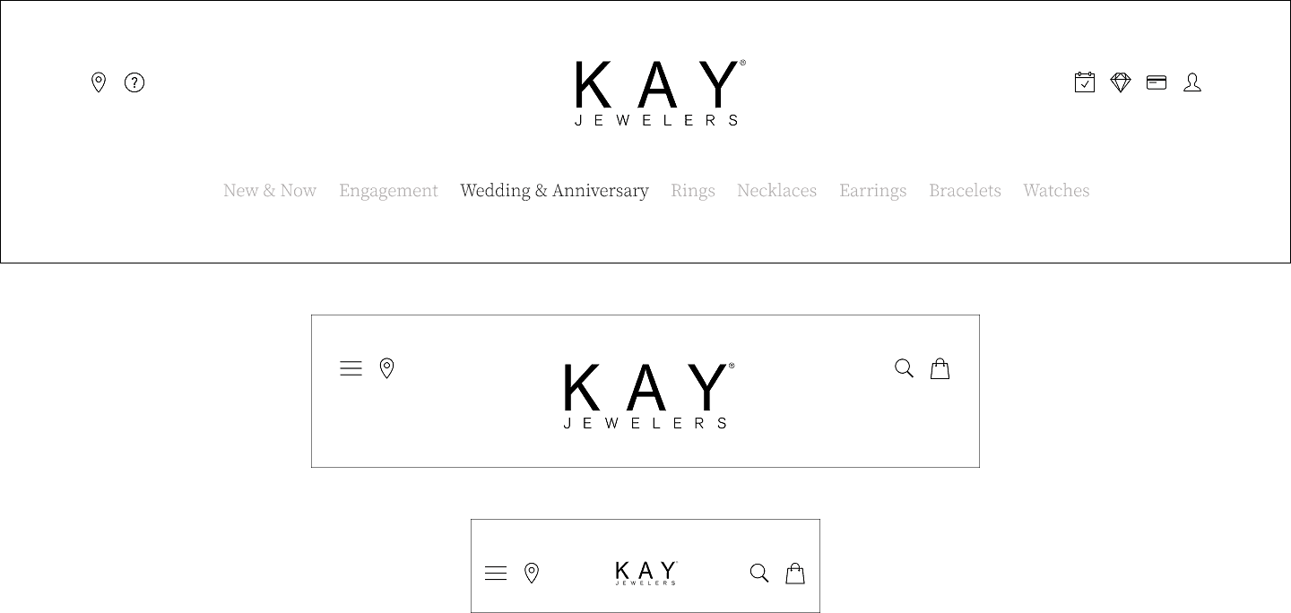
Tablet Experience
Touch-friendly and visually rich
The tablet view maintains visual elegance while enhancing navigation with swipeable elements and simplified menus.
Ideal for browsing on-the-go with a slightly larger canvas.
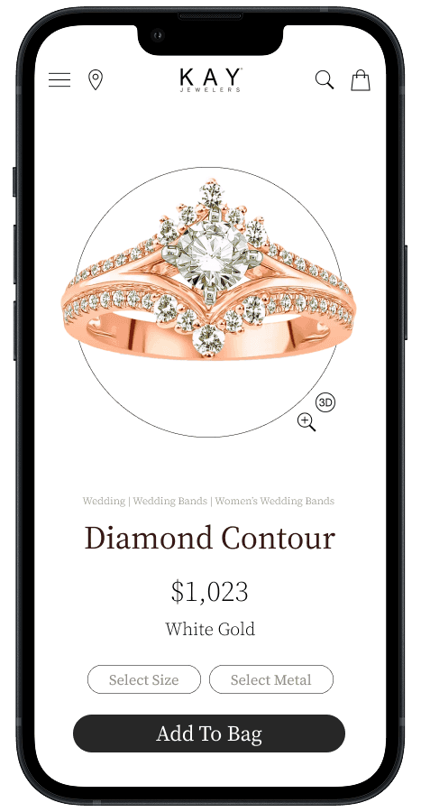
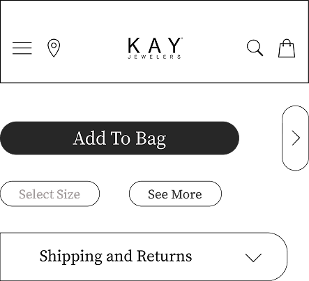
Streamlined and action-ready
Mobile Experience
Designed for speed and clarity, the mobile layout prioritizes essentials: product image, price, ring details, and an immediate path to purchase.
Seamless Across Devices
Responsive Design
The design adapts beautifully from mobile to desktop, ensuring a consistent, elegant brand experience at every touchpoint.

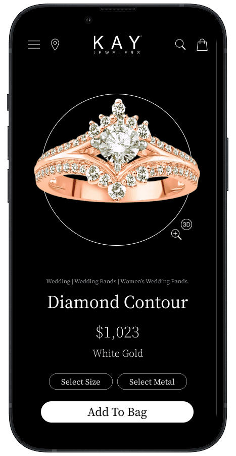
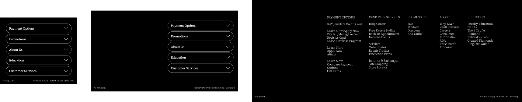
Elegant, accessible, and easy on the eyes
Dark Mode Support
Dark mode improves comfort in low light while keeping the design polished.
High contrast ensures readability without losing the brand’s refined look.
Building a cohesive and scalable visual language
Design System
To ensure consistency across all platforms, a comprehensive design system was developed. Every component was crafted to align with Kay Jewelers’ brand identity while enhancing usability and accessibility.
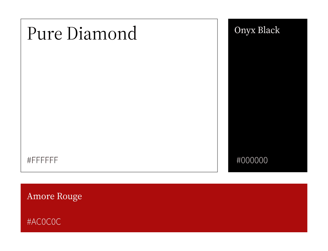
Balancing elegance with passion
Brand Colors
Structured hierarchy across devices
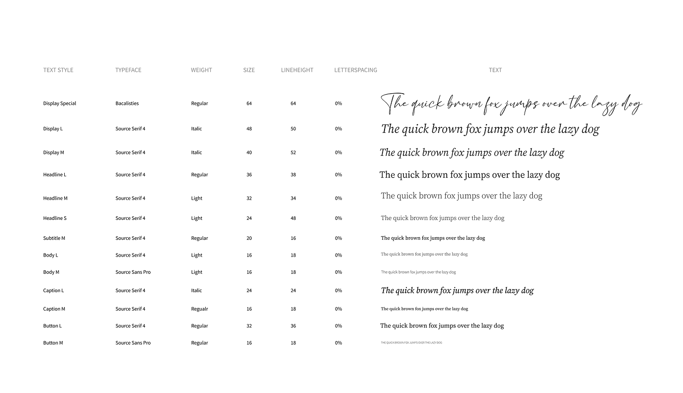
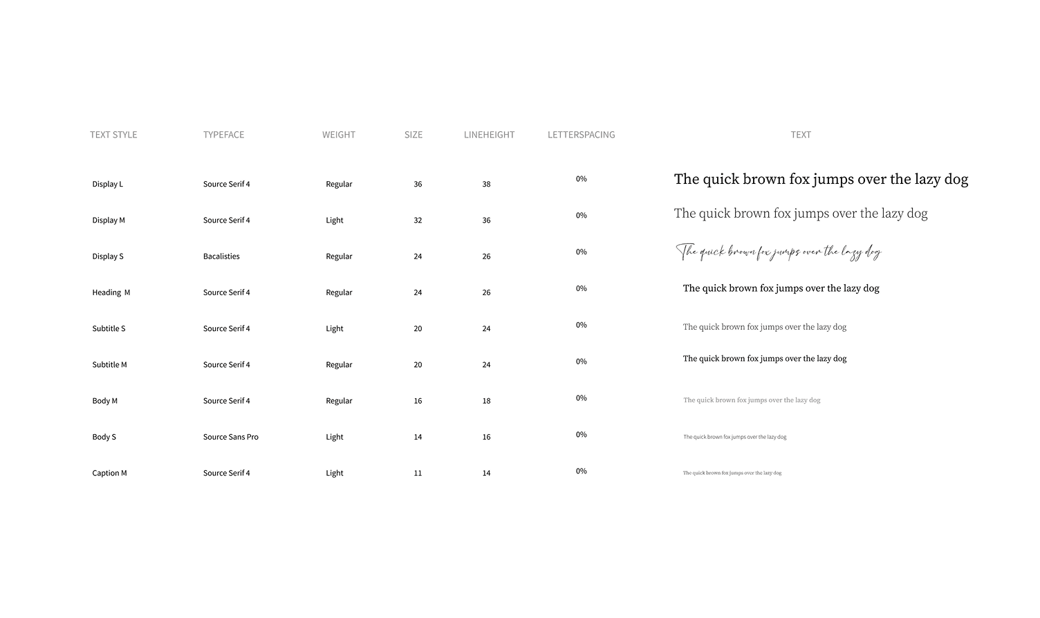
Type Scale
Flexible structure for clean storytelling
Grid & Layout
Highlighting content through modular UI
Cards
Flexible structure for clean usability
Navigation

Reusable elements that feel intuitive
Components
Laying the groundwork
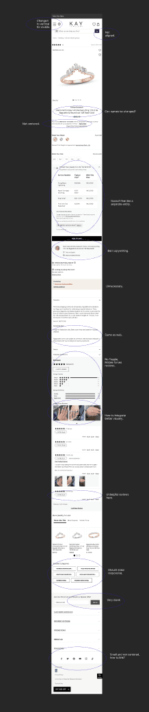
Discovery & Research
The research phase combined competitive analysis, usability reviews, and content mapping to uncover gaps in clarity, product storytelling, and user flow. These insights shaped the design direction and laid a strong foundation for development.
Current Site Design
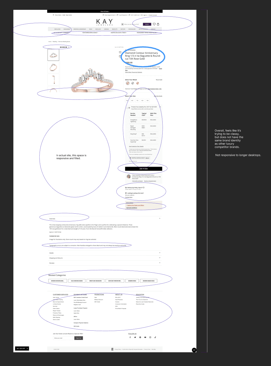
Heuristic Evaluation
Finding the Gaps
A usability audit of the Kay Jewelers product page revealed key issues with clarity, content hierarchy, and user feedback.
Structuring the Experience
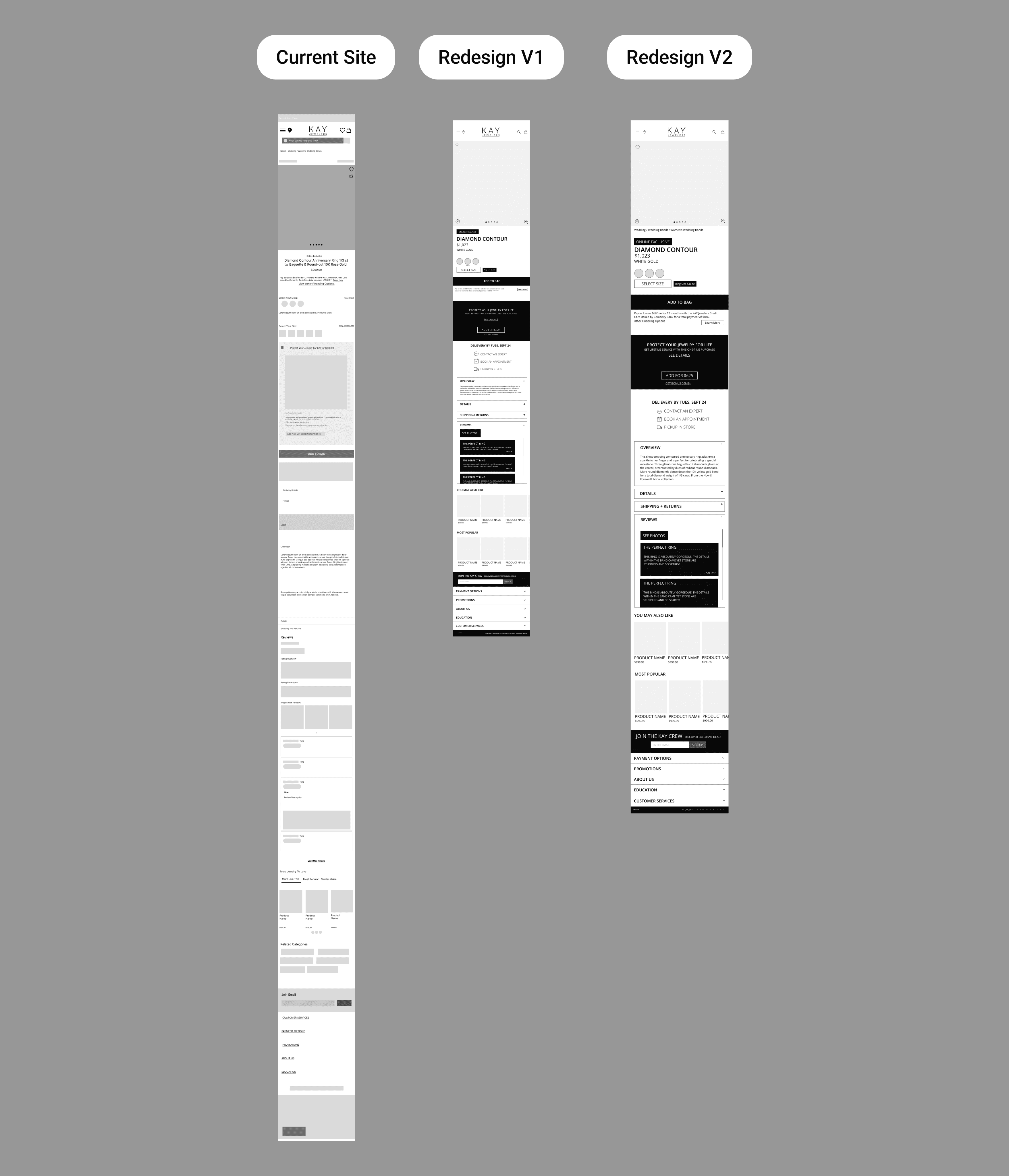
Initial Wireframes
These early wireframes established the structure and flow of the product page.
The focus was on prioritizing key actions, simplifying navigation, and organizing content for a clean, shoppable experience across devices.
Shaping the vision
Design Iterations
Each round refined the balance of elegance and usability, evolving from moodboards to prototypes through feedback and testing.
FInal Takeaways
This project taught me how to balance simplicity with emotional storytelling.
Minimalism challenged me to give every element a clear purpose
Small details, like white space and subtle motifs, elevated the sense of luxury
Reinforced the value of restraint in creating a meaningful and memorable experience
Want to learn more?
In the meantime,
Check out this project

Drift
An Imaginative Dream Experience